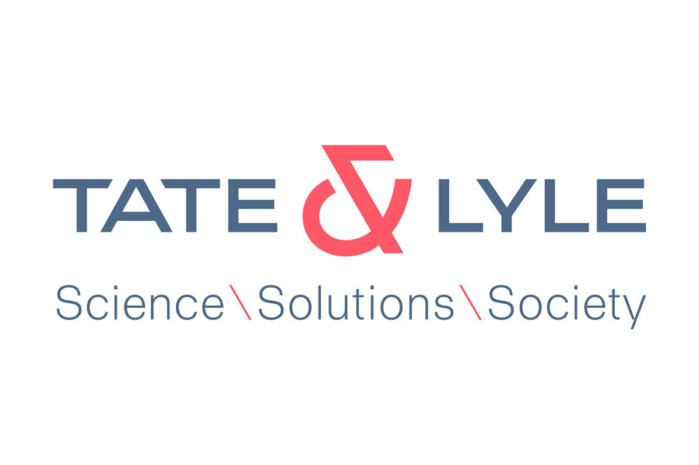
LONDON — Tate & Lyle, PLC has rebranded, which includes a new logo, typography, new imagery and a new narrative: science, solutions, society, the London-based company said Jan. 31.
“Our commitment to science, solutions, society was born out of a deep understanding of our purpose — transforming lives through the science of food,” said Nick Hampton, chief executive. “After all, everything Tate & Lyle does is rooted in science. It’s through R&D and innovation — our understanding of the science of food — that we have the greatest impact, not only by supporting healthy living through our ingredients and solutions but because, by growing our business, we can also have a wider positive impact on our communities and the planet.”
The ampersand played a role in the rebranding.
“As the design work was evolving, we discovered very early on the incredible power of having an ‘and’ — an ampersand — in our name,” said Helen Bass, global head of marketing and insights. “It is not just distinctive but communicates that Tate & Lyle can, and does, bring more. It shows a continuous curiosity and restlessness to solve challenges, go the extra mile and exceed its own and others’ expectations in the broader world. Therefore the ‘power of and’ became a key part of the design.”